The Debrief
By Maya Jacobson 04/22/26
When the end of December rolls around each year, social media feeds are taken over by screenshots of listening stats, music personalities, and top artists, all due to Spotify’s biggest campaign, Spotify Wrapped. What started as a cool way to show a personalized year-end data recap to users has become one of most recognizable examples of a data visualization in our media landscape today.
Turning data Into a Story
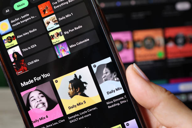
At its most basic, Spotify Wrapped takes a year’s worth of data, including minutes listened, top artists, favorite genres, and turns it into an interactive visual graphic that users can post and share, connecting their music to their friends, families, and followers. Instead of presenting a long list of numbers that most consumers wouldn’t be able to digest, Spotify builds a story around your listening habits. Including what songs you listened to the most, your most listened to genre, and your favorite artists. Spotify isn’t just presenting consumers with random data, they’re showing them their year in music.
This is what makes data visualization so effective as a form of brand communication. People are much more likely to engage with fun visuals rather than blocks of text or with things they honestly have no interest in. Spotify Wrapped simplifies complex information and makes it instantly understandable to audiences. In just a few seconds, users can grasp patterns about their behavior without needing to analyze anything in depth. They can see what they listened to, when, and how much with just a swipe.
Visuals > Words
Using graphics instead of words is a strategic decision on Spotify’s part. In a fast-paced digital environment, users’ attention spans are short and all kinds of content is showing up on their feeds daily. Bright colors, bold, spaced out lettering, pictures, and quick animations make the content stand out and catch the users attention while scrolling. The message is delivered quickly and clearly to users without taking any vital content or data out.
Visual data also can break down social and cultural barriers, making communication more accessible to a diverse range of audiences. Unlike long written texts, graphics are easier for a wider audience to understand, regardless of language or background. This makes Spotify Wrapped more inclusive which is important for a brand of such global standing like Spotify.
User-Driven PR Strategy
Spotify Wrapped acts as just more than a recap, it’s a user-driven campaign. The entire design encourages users to share their results on social media platforms like Instagram and TikTok. I couldn’t even count how many times my friends have posted their results on social media, or even myself. When users post their Wrapped slides, they are basically acting as Spotify ambassadors without even knowing it. It helps create brand visibility across all platforms.
This is strategic communication at its best. Spotify isn’t directly telling people to promote the app, instead it creates content people want to share on their socials and actually want to talk about. This is a creative way to advertise the campaign, without going through traditional channels.
Personalization
Another reason Spotify Wrapped has been so successful is because of its personalized touch. Each user gets a unique set of results, such as being in the top 5% of Lizzy McAlpine listeners (mine, for example), which fosters a sense of individuality that many consumers value and crave. People are naturally drawn to content that reflects their own identity, and music taste is a big part of that.
For users, it can also cause an emotional reaction to see all the songs and artists you have listened to throughout the year, taking you back to specific memories and experiences tied with that music. This emotional element makes the data feel meaningful and authentic rather than purely static, helping strengthen the connection between user and the brand.
Timing, Timing, and More Timing
Starting in 2016, Spotify annually releases its Spotify Wrapped campaign at the end of December, helping ring in the new year. This is an intentional move because it’s a time when people are already reflecting on their past experiences, and what better way to do that than to look at all the music you’ve loved throughout the year. This timing helps turn individual data into a collective moment that all users get to share together. Suddenly, everyone is participating in the same trend, comparing results, and starting a conversation.
And That’s a Wrap
All in all, Spotify Wrapped is a prime example of how organizations can use data visualization as a strategic communication tool that can strengthen their brand. By transforming raw data into visually engaging and emotionally charged experiences, Spotify makes information not only accessible but shareable.
